Dithering for Pixel Artists
Dithering is a technique in digital graphics which uses patterns to create the illusion of greater color depth in situations with real or self-imposed color constraints. In historical applications of pixel art, dithering was often a necessity, as old platforms were limited in various ways. Due to the blurring and scaling inherent in CRT display technology, dithering patterns were less visible than they would be on modern displays. Some systems, like the Commodore 64, whose output used stretched or non-square pixels, gave dithering an entirely distinct look. Now, any color limitations in our pixel art are self-imposed, and dithering displayed on modern screens does not convey the same effect. The things we find appealing in modern pixel art are different than they once were, but they are still influenced by techniques, including dithering, developed to cope with now obsolete restrictions.
I hardly ever use dithering in my own pixel art because I do not find it necessary for the sort of things I usually create, particularly in my personal work—nor do I often find it aesthetically appealing, as it tends not to be when applied with reckless abandon. That is not say that dithering does not have a place in the modern pixel art landscape, or that I don’t use it when appropriate, but pixel art beginners seem to feel like they must use dithering, perhaps as a way of making sure they have a full understanding of all pixel art concepts and techniques. Dithering is rarely, if ever, necessary in modern contexts, but once you truly understand how it may be used, you can decide whether or not it should be used for each individual piece or project.
Similar to the way in which anti-aliasing (or "AA") works fundamentally, dithering uses the color data from multiple pixels of differing colors to convey new color information through the application of certain dithering patterns which imply different perceived values and colors. Therefore, the amount of one color within a larger area of another color affects the overall perceived color and may convey a color gradient or smooth transition between colors by utilizing certain patterns or a sequence of patterns. In a way, dithering is a sister to AA, and, similarly, you can use it creatively in order to preserve a low color count and create a cohesive color palette, or otherwise affect an overall look and style. The concept of dithering is similar to hatching, cross-hatching, and stippling in the traditional art world, and you may sometimes use dithering patterns which look similar to ones used in those techniques.

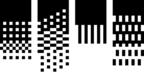
There are two general ways in which dithering may be used, although the dithering patterns remain the same between both applications:
- Fill Dithering: used to create an additional color by combining two pre-existing colors. This is generally applied as a "fill" consistently throughout an entire form or space, and is most useful for 1-bit or otherwise low color count pieces. This is similar to the way the printing technique of halftone is sometimes used in comics and screenprinting.
- Transitional Dithering: used to smooth a transition between two colors or soften an edge. This type of dithering is most useful for relatively higher res pixel art with a more painterly aesthetic, and (for the latter purpose) generally works best when used sparingly.
Regardless of the application, some sprites are simply too small to dither relative to the amount of detail they can possibly contain. For example, I would not recommend dithering for most character sprites, especially those that will need to be animated.
Fill Dithering
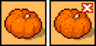
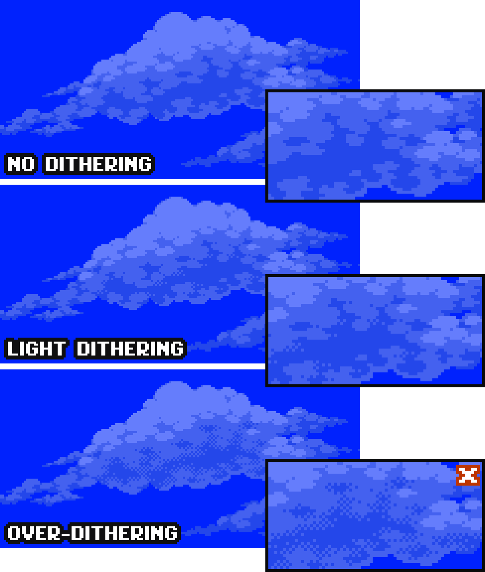
In both use cases, dithering softens edge definition and may disrupt the integrity of forms. Whether or not this is a benefit or a hazard depends on the intention and the execution. One should be especially careful with the application of fill dithering, where such softening is more likely to cause issues in conveying form. However, certain angles (such as 45 degrees–a 1x1 pixel diagonal) may be less disrupted due to the way certain dithering patterns align with the edge. Also, the higher the resolution of the piece, the more minimal this effect will be overall, as each individual pixel holds less visual information relatively. 1-bit pieces with dithering will benefit from a higher resolution in general, as certain dithering patterns inherently require a certain amount of adjacent available pixels.
Transitional Dithering
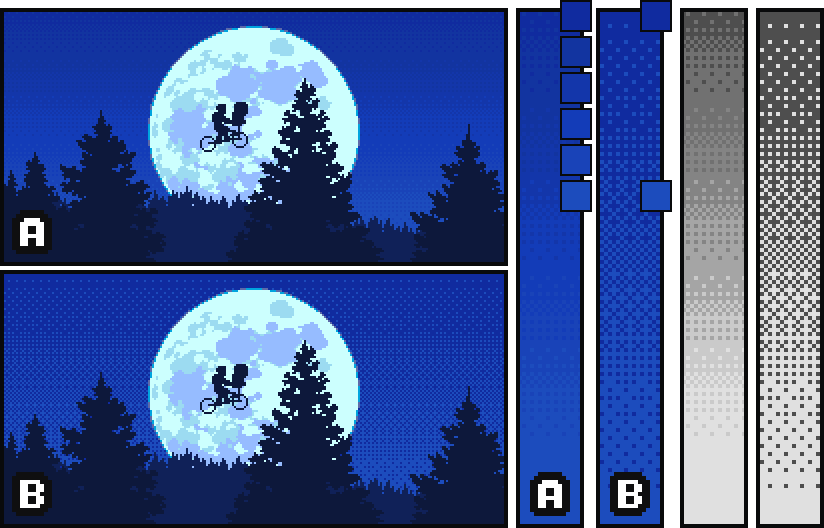
When using dithering to transition or to smooth, a good rule of thumb is that the greater the contrast between the two colors you are blending, the more dithering steps you will need (and in turn the greater the resolution required.) Rather than transitioning between every pattern available, try selecting just a few and varying the number of rows/columns (depending on the direction of the gradient) between pattern steps. If you are creating a high contrast gradient, consider using the same few dithering patterns but adding in a few in-between color steps. You can also vary the number of rows/columns between these intermediate color segments. Keep in mind that even if your dithered gradient looks smooth at the native resolution, the pattern will become more obvious as you zoom in or as the image is displayed at a larger scale. Because of this, you must consider the effect dithering inevitably gives in the context in which the piece will be displayed when deciding whether or not to use it.
Creative Dithering and Modern Application
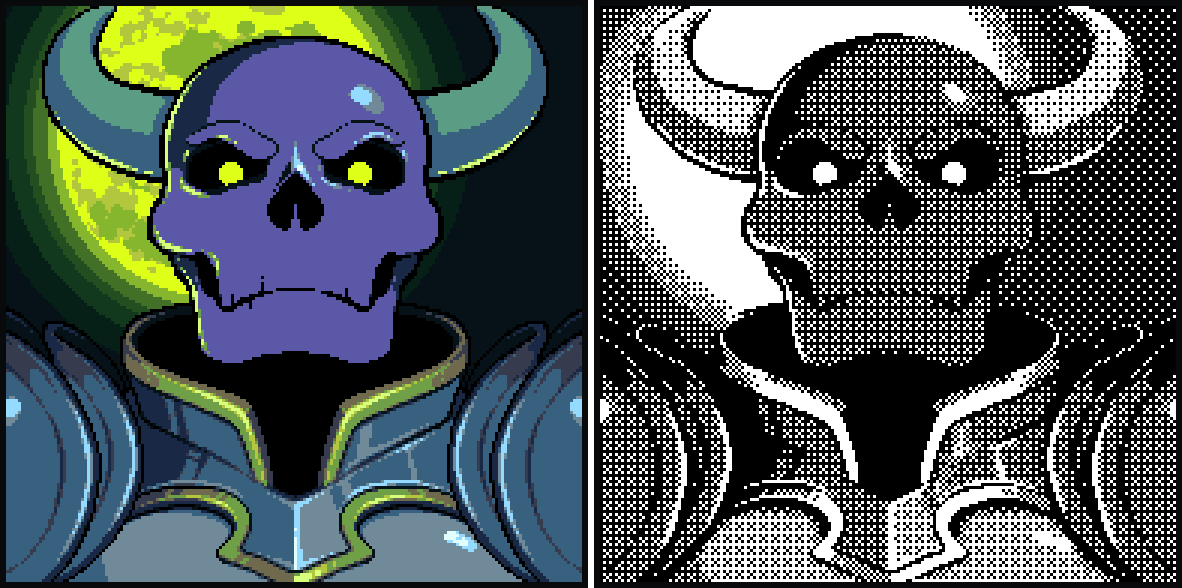
A common cliche in modern pixel art circles is to say that dithering is a good way to "add texture," but dithering was largely not intended as a textural tool, and I find its use toward this end to generally result in superfluous noise that doesn't achieve the stated goal. However, sometimes dithering may be used to add visual interest or to create an intentional effect of literal dirt or grime. Some modern pixel artists, particularly those in the Japanese dotpict app scene, are using dithering in new and creative ways which give their works an interesting aesthetic.
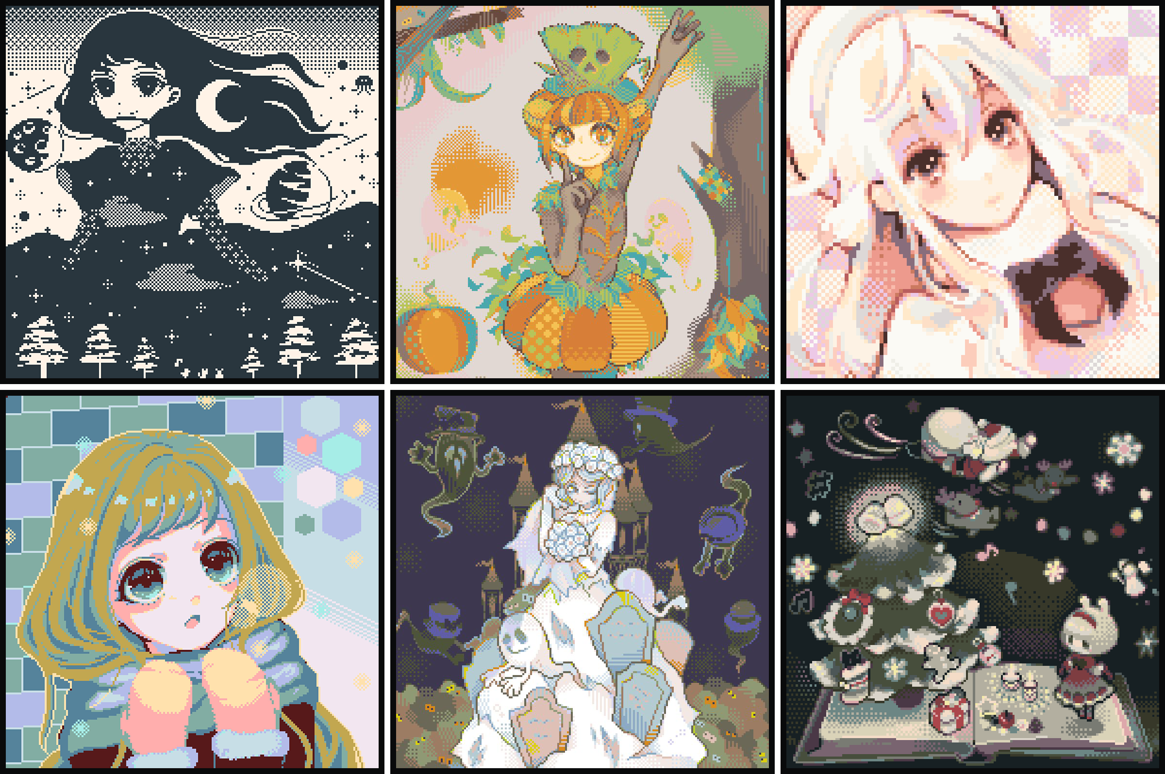
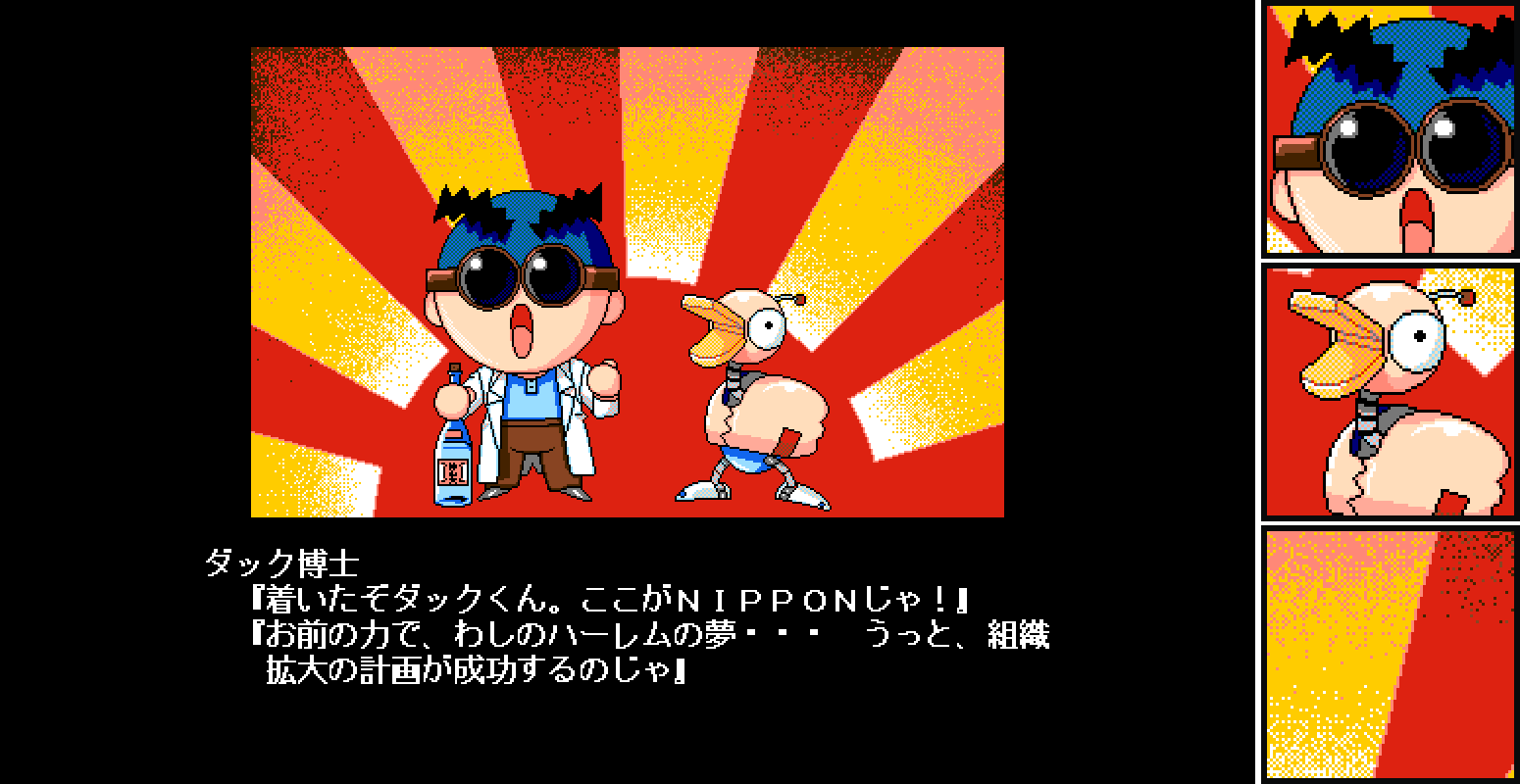
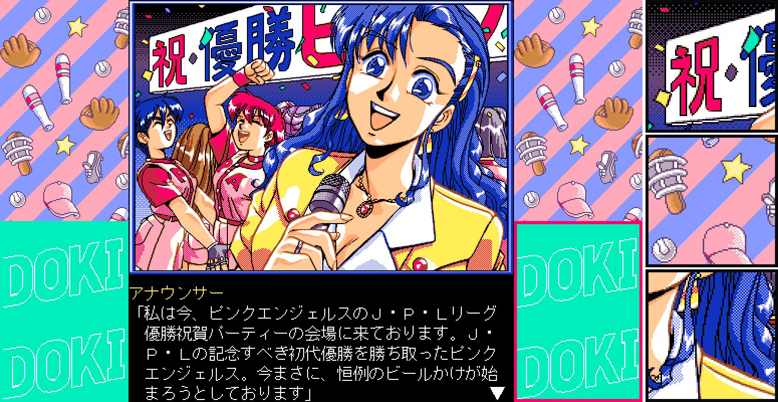
Many PC-98 games used dithering creatively in both methods in an attempt to replicate other media like anime and to make the most of the available tools. I recommend checking out the Twitter account @PC98_bot for your dithering inspiration and enjoyment.
In the early days, dithering often was applied painstakingly by hand—Eternal Champions artist William Kier has stated on the How Did This Get Played? podcast that all dithering in the 1993 Sega Genesis fighting game was done manually, and it is likely the case that most games of even earlier eras were also dithered in this way. Veteran pixel artist Henk Nieborg stated on Twitter that he applied dithering by hand on the 1992 Amiga title Lionheart in order to create additional colors, and that British software developer The Bitmap Brothers also used this technique frequently.
Pixel art legend Mark Ferrari shared with me (via direct message) that the standard 2D art tool of the time, Deluxe Paint (or “Dpaint”) and later Deluxe Paint II, did have a selection of gradient auto-fill options (although the SCUM engine used at Lucasfilm initially did not have the ability to compress dither, which rendered those tools unusable up until the development of Loom and the original Secret of Monkey Island.) He also stated that he would often hand make a section of a gradient pattern and apply this using a custom brush.
Nowadays, there's no reason not to use shortcuts. For applying dithering in the "fill" method, consider creating a dither pattern in your software of choice and applying it with a fill tool, or try applying a dither pattern as a mask or to a masked area of another layer.
For using transitional dithering in a more painterly approach, I recommend checking out Dan Fessler's HD Index Painting technique, which translates your brush strokes into dithered pixels automatically. Work smarter, not harder! Ask yourself if your pixel art really needs to be dithered—and if it does, try and make the process as painless as possible.
Subscribe to Pixel Parmesan
Get the latest posts delivered right to your inbox