Anti-Aliasing Fundamentals for Pixel Artists
The pixel is the smallest unit of digital displays and of pixel art as a medium. The arrangement of these pixels in rows and columns creates something called "the grid," which is the implied vertical and horizontal lines that divide individual square pixels. No pixel can be placed in between the lines of this theoretical grid, and no pixel can be smaller than an individual square of the grid. Anti-aliasing is a technique used to subvert the limitations of the grid, and to create the illusion of smooth forms and blended colors. In digital art, brushes and tools are almost always anti-aliased by default to allow for a smooth effect which replicates traditional media. Pixel art, by definition, does not utilize anti-aliased tools, so it is considered to be aliased. Although it may seem counter-intuitive, anti-aliasing (commonly referred to as "AA" in the pixel art world) may be applied to your pixel art, but it has to be applied judiciously and by hand.

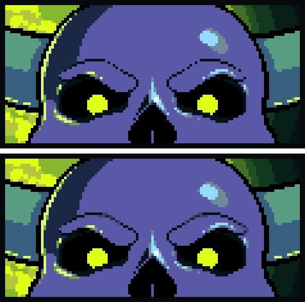
In order to use AA correctly, you must understand the concept of perceived value (sometimes also known as luminance,) which means that every single color has an implicit measure of lightness or darkness. When placed adjacent to one another, our brain subconsciously interprets the relative values of pixels, deriving information from them about the form, location, and lighting conditions of whatever they make up. AA utilizes subtle shifts in perceived value of pixels to create the illusion of "breaking the grid" in order to convey form and detail technically impossible within that grid.
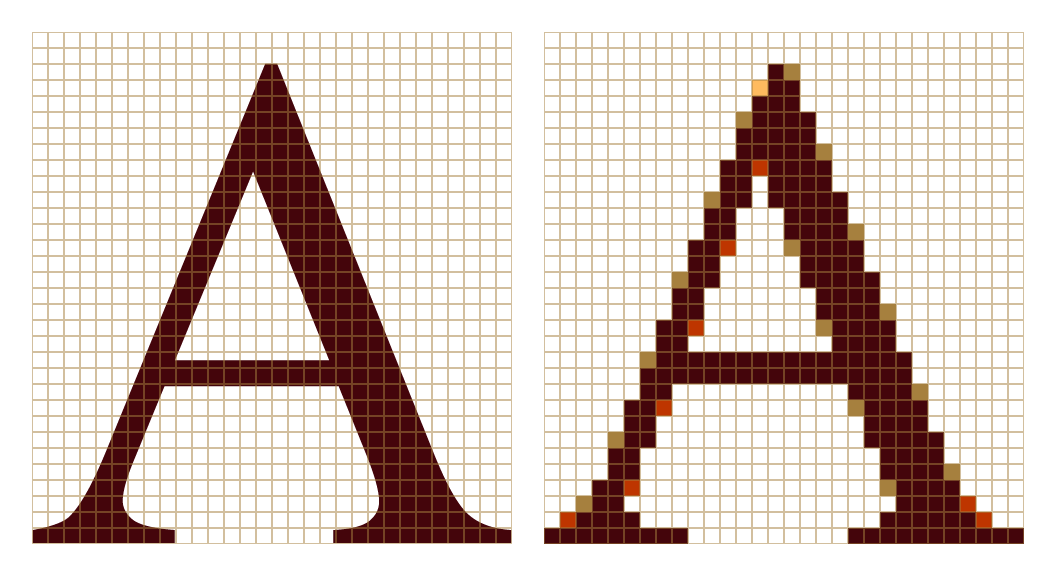
Traditionally, AA is used to remedy what are called "jaggies"—groups of pixels which form particular line patterns that are deemed not representational enough of the line or curve they are meant to imply. A color with a value in between the value of the form and the surrounding area is applied to blur or smooth the form. The value of the selected color is relative to how much the line or curve theoretically protrudes into surrounding squares of the grid, were that technically possible. A color closer in perceived value to the original line color (rather than to the square it is replacing) implies more filling of the square, and a color further in perceived value from the original color implies less filling. So, in theory, if the square would be filled 50%, you should use a color with the perceived value of 50% the opacity of the original color added to the color you are blending into. If the square is filled 25%, the color should have the perceived value of 25% the opacity added to the color you are blending into, etc.

This may seem tedious and overly mathematical, but in reality this does not require total precision. You do not need a new shade of AA for every subtle shift in angle or curve. Rather than simply averaging the two colors you are transitioning between, which can look muddy and boring (especially when blending between two complementary colors,) try using a different color that has an approximately analogous perceived value. I’ve found that keeping the hue of each anti-aliasing color pulled significantly more towards either end of the colors you are blending between tends to work well. You can even reuse colors from different parts of the sprite, which can help tie a piece together and keep your palette manageable. The hue of the AA is not particularly important towards the purposes of blending or smoothing, as long as the perceived value is approximately correct, although hue choices do have an effect on the overall tone and style of the work.
A decent rule of thumb is the longer the segment, the longer the AA. With longer segments of anti-aliasing, you may want to use more than one shade of AA pixels to achieve a smoother effect. When this "stacked" AA occurs, rather than using many colors of single pixels of adjacent AA, try using a couple colors with varying lengths of each color. A commonly accepted "rule" is that you will want to use more pixels of AA closer to the original shade and less as the AA comes to an end. However, having many pixels of color closer to the original value will give the illusion of a thicker line than many pixels of a value closer to the color you are blending into, so you may want to reverse the order depending on the effect you are going for. Remember that anti-aliasing is not always simple addition— you can use multiple pixels of a greater (brighter) perceived value to convey a similar but ultimately different form than one single pixel of a lower (darker) value.
Some people use certain rules or formulas to determine how long the AA should be based on a certain percentage of the length of the pixels you are anti-aliasing. Really, it depends on what you are trying to convey and how it looks when you try it. I recommend keeping a 100% version visible to check your progress, or you can also just zoom out periodically if you prefer.
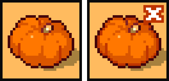
One thing to watch out for when anti-aliasing is called banding, which occurs when lines of the same length are placed parallel to each other in a sprite or piece. Banding does not smooth shapes as anti-aliasing does, it only draws the eye by reinforcing the theoretical grid and interferes with the form you are trying to convey. Banding is essentially the same thing as a parallel tangent, and when applied consistently throughout the contour of a shape it can lead to pillow shading, which also ruins the illusion of directional lighting and form. Tangents are generally to be avoided, in pixel art and in any other type of art, as they break up the flow and draw the eye in an unpleasant way. (Even if two pixel clusters are not touching, they can still be tangents if they are the same length and run exactly parallel to each other.)
One shortcoming of pixel art as a medium is the lack of subtlety in line weight, which can more easily be utilized in other forms of art to add to the illusion of texture, form, lighting, and perspective. One way to simulate this in pixels is with anti-aliasing. Be careful when using AA on outer edges of game art in particular, as this may not always look the way you intend depending on the background the sprite is placed on. If you have to, you can utilize semi-transparent pixels towards this purpose—I have found this useful for FX animations for games. I generally recommend keeping the AA to inside the sprite, as it can really inhibit the readability of a sprite, although it can be used effectively in individual pieces depending on the style.
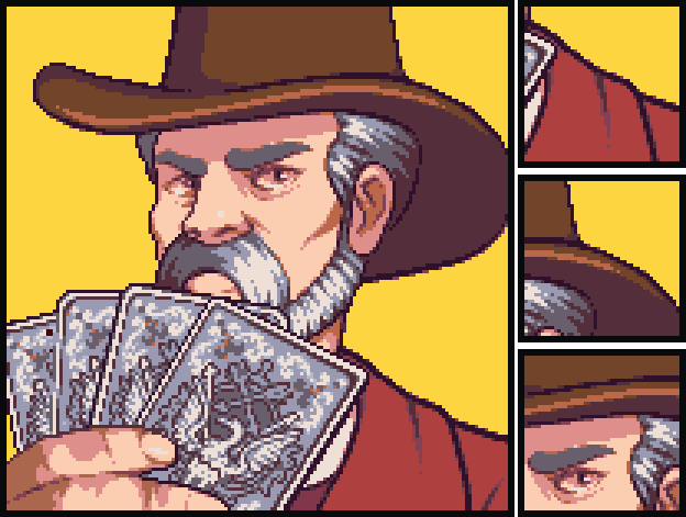
Sel-out (selective outlining, sometimes also known as broken outlining,) is an area of pixel art that, in my opinion, lacks in thorough examination—the little information that is out there being contradictory and ill-informed. Sel-out is actually just AA applied to the outlines of a sprite specifically. It still uses lighter and darker pixels (or even the absence of pixels) to convey where a form pushes out into or recedes from the outline. There is a difference functionally between directional lighting and sel-out on linework. One conveys the illusion of a light source only while the other also conveys form. While selective outlining can be utilized to further the illusion of three-dimensional form and convey greater subtlety, it is a stylistic choice and may or may not be appropriate depending on the overall style and purpose of the work. A pure black outline may be easier to animate and easier to "read" in-game, but this will also give a much flatter, more symbolic (rather than representational) effect to the sprite. Be sure you know what type of linework principles you are attempting to use in your sprites and why you are using them. Because sel-out is frequently used thoughtlessly and purposelessly, it has a bad reputation in some peoples' eyes. Sel-out shouldn't just be "making the corners dark."
I tend to utilize the breaking of inner lines to convey the softening of an edge or the meeting of two masses, rather than AA. Because the brain processes a broken line similarly to an anti-aliased line, this allows me to convey subtle form shifts without additional colors in a way that is cleaner and more delicate.
It's worth noting here that subpixel, as its name implies, is actually just AA but applied to an animation. It conveys shifts in position that are smaller than an actual pixel and therefore technically impossible. I think a lot of people don't really understand subpixel because it is often treated as a separate technique from AA, which it really is not at its core.
Subpixel is generally used on small sprites, which inherently have less capacity for subtlety in their range of movement, as well as on small details of larger sprites. If a sprite is only 16 pixels tall, a single pixel of movement may be much more of a shift in position than the action requires. By utilizing shifts in color within the sprite, more subtle animations are able to be achieved.
Anti-aliasing is not necessary for all styles of pixel art, and beginners may find that it only hinders and overwhelms them rather than elevating their work. While you should aim to have an understanding of how it functions, as the concept is fundamental to the illusion of pixel art as a whole, don't feel obligated to use it all the time or at all. IMO the predisposition towards excess anti-aliasing may be a relic of old schools of thought, where pixel art was the only option and the goal was to create as realistic of an image as possible. Now that pixel art is a choice, we choose it for its certain character. Why pretend it's not made of pixels? It's pixel art!
If a sprite is too small, AA might read as noise, and, if a sprite is large enough, AA might not be necessary to convey the desired form. Sometimes, especially on larger sprites, there are certain line patterns which may seem to be "jaggies" but in fact define a subtlety of a form which does not need to be smoothed. Always ask yourself "is this really necessary?" before you begin anti-aliasing with abandon. Many times you may find that the answer is "no."
Subscribe to Pixel Parmesan
Get the latest posts delivered right to your inbox